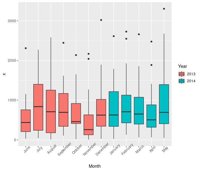
R – native and ggplot boxplots

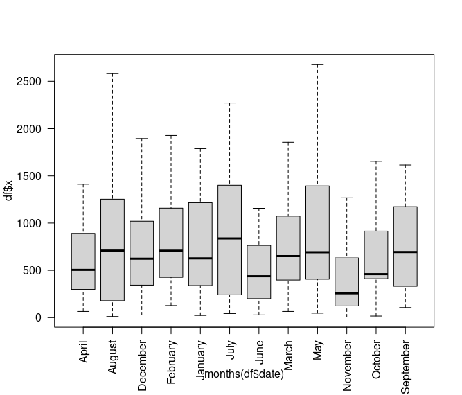
date <- seq.Date(as.Date("2013-06-01"), as.Date("2014-05-31"), "days") set.seed(100) x <- as.integer(abs(rnorm(365))*1000) df <- data.frame(date, x) boxplot(df$x ~ months(df$date), outline = FALSE,las=2)
library(ggplot2)  ggplot(df) +   geom_boxplot(aes(reorder(format(date,'%B'),date),fill=format(date,'%Y'),x)) +         xlab('Month') + guides(fill=guide_legend(title="Year")) +         theme(axis.text.x = element_text(angle = 45)) 

R – ggplot example

$ head dl.csv  time,code,count 6:59,200,31 7:00,200,1841 7:00,502,3644 7:01,200,369  > x<-read.csv("dl.csv") > library(dplyr) > library(tidyverse)  > ggplot(x,aes(time,count,color=code))+geom_point()+scale_x_discrete(breaks = levels(x$time)[c(T, rep(F, 5))])+theme(axis.text.x = element_text(angle = 90, vjust = 0.5, hjust=1))  

R – graph by month

> options(scipen=5) > jan20<-x[grepl("2023-01",x$date) & x$enabled > 0 & x$ignore==0,] > barplot(tapply(jan20$users,jan20$date,sum)/1000,las=2,main="Jan 2023 - by month",col=rainbow(10),cex.names=0.8)

R – Read in CSV

> setwd("/Users/mark/Documents/Stats") > x<-read.csv("sites.csv",sep="\t",stringsAsFactors = F) > summary(x$url) Length     Class      Mode     983002 character character   > summary(x$score)    Min. 1st Qu.  Median    Mean 3rd Qu.    Max.    NA's   -3.000  -2.000  -1.000   1.977  -1.000  25.000       1 

R – Package List

How to list all packages that have been imported into current session

> (.packages())

Example output

> (.packages()) [1] "stats"     "graphics"  "grDevices" "utils"     "datasets"  "methods"   [7] "base" 

To see if a package is installed:

> x<-grep("tidyverse",installed.packages()) > installed.packages()[x]

Install a number of packages as below:

> install.packages(c("nycflights13", "gapminder", "Lahman"))

R – Quickly Graph

How to quickly paste into R and get some results on a Mac (just change pipe/paste for diff OS)

df<-read.table(pipe("pbpaste"),sep=" ")
names(df)<-c("date","time","count")
df$dtg<-strptime(paste(df$date,df$time,sep=" "),"%Y-%m-%d %H:%M:%S")
plot(df$dtg,df$count,las=2)

R – Sum by category with tapply

Good use of R’s tapply function to summary data ..

## read a csv file into a table called x – the first row contains column names

x<-read.table("2014-tax.csv",sep=",",header=T)

## In my instance column names are Item,Amount,Cat,Month,Who
## split out by Who

bob<-x[x$Who == "bob",] jane<-x[x$Who == "jane",]

## Spin around each row (obs) and sum the Amount

print(tapplybob$Amount,bob$Cat,sum))

## Typical output for bob #

#  books  equipment licences stationery  supplies    telephone 
# 303.00 694.27 132.00 345.50 96.00 30.00
#


# Then for jane

print(tapply(jane$Amount,jane$Cat,sum)) 

# books equipment licences stationery supplies telephone 
# 163.0 583.0 348.0 678.4 11543.0 NA
#
#
R – Shiny DashBoard


“Having studied Data Science since April 2014, felt it a good time to get to know Rstudio’s Shiny Server! So sourced data.gov.au’s Disaster Events and built an interactive dashboard. Writing up my experiences as a way of introduction, in the hope it might help others to learn Shiny Server.”

If you just want to see the demo first » CLICK HERE «

  1. First requirement is to have a fair understanding of R. There are a ton of courses online, such as on Rstudio, EDX and Coursera. My favourite course is MIT’s Analytics Edge. As a currently archived course you can complete it self paced, although assessments are disabled.
  2. Next to complete the Shiny Tutorial. It is very comprehensive and the only requirement is Rstudio, naturally. Previously the tutorial comprised 3 parts, but now are presented in the single video lasting a bit of 2 hours 25 minutes. I highly recommend it.
  3. Study the Shiny Dashboard Instructions – my source code might help too
  4. References:
Now onto my demo!

The Australian government provides public access to numerous data sets and encourages re-use. Therefore chose data from data.gov.au to build my demo, as it is freely available.

This is what the data looked like: raw-data

Quick preview of what I achieved thanks to Shiny Dashboards:
ausgov-homes-destroyed ausgov-world
The example I created converts a CSV file to data tables, graphs and map of Australia using uses RStudio’s Shiny Dashboard =>

Australia Government Disaster Events Dashboard

And the Source code

Lastly this tutorial helped with the maps.

Enjoy and feel free to comment below – would be good to receive feedback.